Branding #
The branding of the portals can be updated as required. To change the portal branding, enterprise portal users need to have the Branding Administrator role assigned.
Any branding changes made to the enterprise portal will be inherited by the sub reseller and customer portals.
If given permission, resellers can override the portal branding at account level if required.
danger
Changes to the branding will be applied to all sub accounts: both resellers and their customers.
Branding Items #
The images below outline the various items within the portal branding which can be customized.
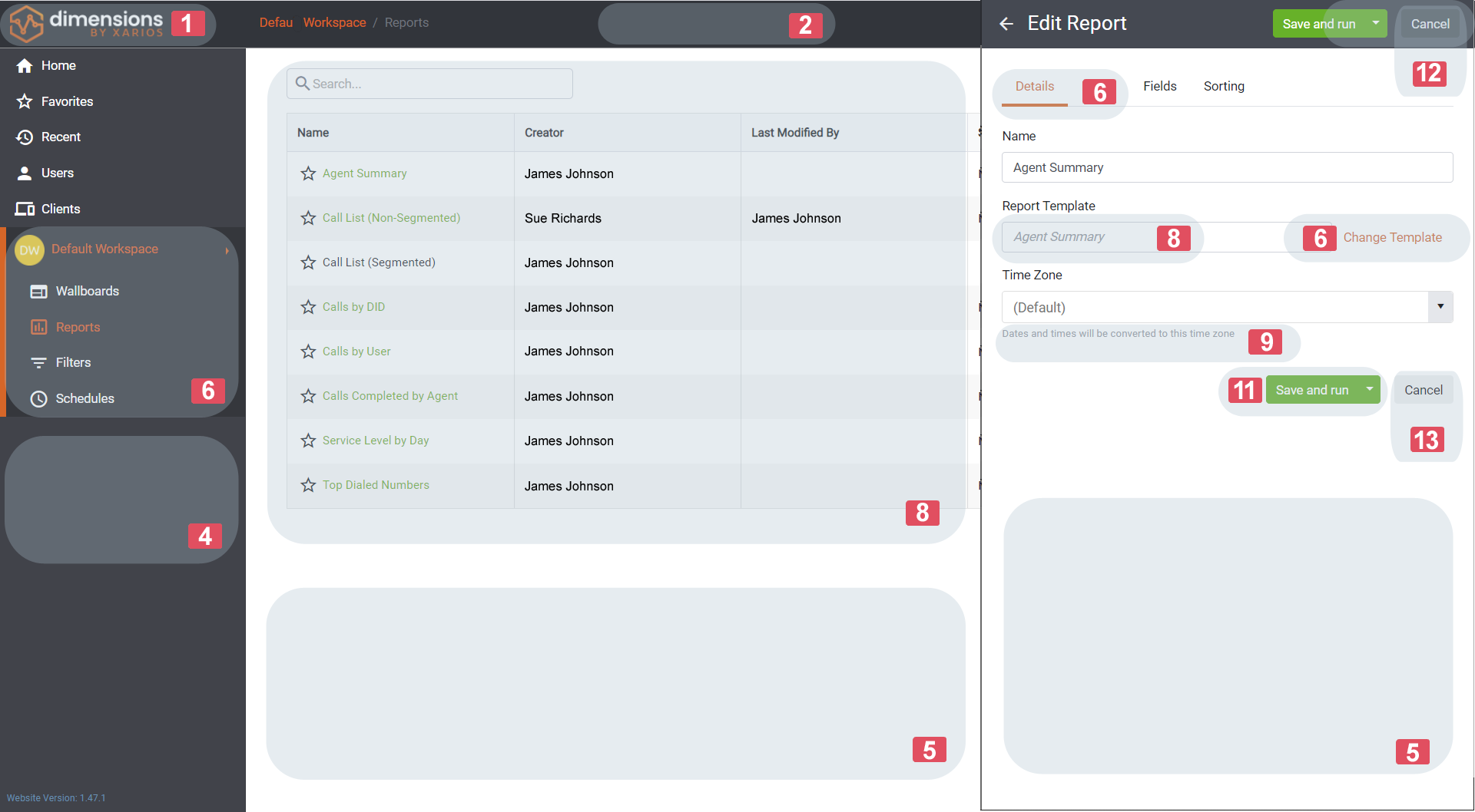
The index in the image can be used to identify the specific properties names in the tables below.
To see what affect the changes have on the enterprise portal, toggle the 'Enable Live Preview' switch. Changes will not be saved or applied to sub portals until the 'Update Branding' button is pressed at the bottom of the page.
At any point, the default portal branding can be restored by pressing the 'Reset To Default' button. To complete the reset operation, you must type 'Delete' when prompted.
Main Items #
| Index | Item | Description |
|---|---|---|
| 1 | Logo | The 'Home' icon for the website. Can be replaced with .jpg, .png or .gif (Size required: 182x45) |
| 2 | Navigation Bar Background | Background color for the top navigation bar |
| 3 | Navigation Bar Text | Text color for the main top navigation bar |
| 4 | Side Bar Background | Background color for the side bar. A slightly darker color is automatically generate for selected side bar items |
| 5 | Main Background | Background color for the main content area for the portals |
| 6 | Theme Accent | Theme color for primary hyper-links, tab and grid accents etc |
Headings & Text #
| Index | Item | Description |
|---|---|---|
| 7 | Heading Text | Text color for content area headings |
| 8 | Body Text | Text color for content area body |
| 9 | Information Text | Text color for content description information |
| 10 | Menu Item Text | Text color for menu items |
Buttons #
| Index | Item | Description |
|---|---|---|
| 11 | Primary Action Button | Background color for the primary action buttons (Save, Add, Create etc) |
| 12 | Dark Secondary Action | Background color for secondary action buttons on main content areas (Cancel etc) |
| 13 | Light | Background color for secondary action buttons on heading areas (Cancel etc) and tool-bars. |
Notifications #
| Item | Description |
|---|---|
| Error Text | Text color used for error messages |
| Success Test | Text color user for success messages |
| Warning Text | Text color used for warning messages |
note
The background color for notifications is automatically updated based on the text color chosen.